Fetion

Project Overview
Background
Fetion, an enterprise communication app by China Mobile, faced low user engagement and dissatisfaction with its application mall module. Users struggled with its interface and navigation, impacting overall app usage.
Product Problems
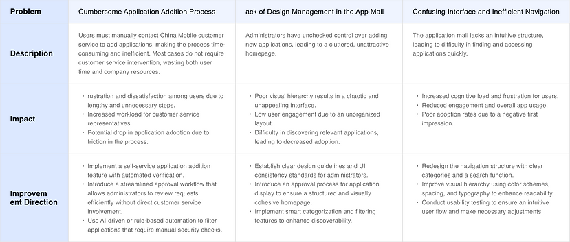
Based on the user complaints, the main issue was the application mall module, which had poor usability and low adoption due to a confusing interface and inefficient navigation, leading to underutilization.
Structural Chaos
The app had a confusing structure with a cluttered interface, lacking hierarchy and intuitive navigation.
User Complaints
The application mall process is unclear and users cannot access it quickly and directly.
Unclear Interface
The previous interface suffered from poor layout and color schemes, which hampered user recognition and overall experience.
My Role
As a UX designer, I iterated on the design of mature app malls based on user test feedback to enhance the user experience and boost engagement. My goal was to optimize this module for a more intuitive and efficient experience, driving higher adoption and increasing overall satisfaction with Fetion.
Duration:
My responsibility:
October 2019 – December 2019
Leveraging user feedback from UX researcher's insights, I collaborated closely with product managers and developers to rapidly define design optimization goals. My responsibilities included structuring the functional hierarchy, refining icons, simplifying feature classifications, optimizing user flows, and creating design specifications. By aligning the team and streamlining the design process, I ensured the successful delivery of an improved user experience.
Optimization design process
User Analysis
Identified and analyzed app mall issues through user feedback
Visual Analysis
Analyze visual problems of existing user malls
Optimize design
Solve UIUX issues based on all analysis
Feedback
Test designs and optimize until user satisfaction is achieved
User problem Analysis
To address the existing issues in the Fetion application mall, I conducted a comprehensive analysis based on user research data from UX researchers, backend user feedback, and multi-channel user complaints. I identified recurring usability challenges that significantly impacted the user experience, analyzed their root causes and effects, and defined key areas for improvement. These insights informed the subsequent design strategy, ensuring a more efficient and user-friendly experience.
Visual problem Analysis
After identifying key user pain points, I conducted an in-depth analysis of user experience issues, focusing on the app mall homepage—the most frequently complained-about area. Due to long-term mismanagement, the homepage lacked visual consistency, had weak layout hierarchy, and made app discovery difficult. Additionally, inconsistent and unregulated icon uploads by multiple administrators resulted in a cluttered and unappealing visual experience. These insights guided the subsequent design optimization, primarily improving icon consistency and layout structure to enhance usability and aesthetics.
Layout Problems
-
Streamlined the layout to enhance clarity, making it easier for users to identify key elements quickly.
-
Addressed visibility issues by adjusting font sizes and color contrasts, significantly improving readability and overall user experience.
Icon Problems
-
Standardized the shapes and patterns of icons for consistency and ease of recognition.
-
Resolved irregular icon colors by implementing a cohesive color scheme, enhancing visual clarity.
-
Enlarged the clickable areas of icons to improve usability and user interaction.

Design Direction
Based on the in-depth analysis of user pain points and experience issues, I defined key design optimization directions and set the following design goals:
Streamline the Application Addition Process
Reduce friction by implementing a self-service request system with automated verification and a more efficient approval workflow.
Enhance Homepage Usability
Improve visual hierarchy, layout consistency, and navigation to enable faster app discovery.
Standardize Visual Design
Establish guidelines for icon uploads to ensure uniformity and a polished, professional look.
Interaction Optimization
Structural Optimization for Enhanced Usability
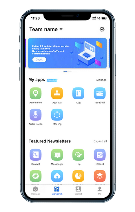
Firstly, I restructured the framework of the application mall by introducing an online application module, enabling users to apply for apps seamlessly without the need to contact customer service. This improvement ensures a smooth integration with China Mobile’s internal business processes while addressing a major user pain point. Additionally, I optimized the design structure to enhance clarity and recognition, creating a more intuitive and user-friendly experience.
User Flow Optimization for a Seamless Experience
After defining the content structure, I refined and streamlined the user journey within the application mall, making interactions more direct and user-friendly. While maintaining necessary procedures such as administrator reviews, I optimized the workflow to minimize friction, addressing key user pain points. These improvements enhanced usability and efficiency, ultimately improving user retention and satisfaction.

High-Fidelity Redesign & Process Optimization
With finalizing the user flow, I collaborated closely with the product manager and developers through quick discussions and iterative revisions to refine the final solution. Based on these insights, I redesigned the high-fidelity prototype for the application addition and review process. This redesign directly addresses user challenges in quickly finding and applying for apps, significantly enhancing the overall experience. Key optimizations include streamlining the app addition process and improving the app approval workflow, ensuring a more efficient and user-friendly interaction.


Visual Optimization
With the user process optimization in place, I shifted focus to enhancing the overall user experience, particularly addressing the visual inconsistencies on the application mall homepage. Key improvements included refining the category layout for better organization, redesigning icons to create a more cohesive visual identity, and establishing standardized guidelines for icon uploading and cropping. These enhancements not only improved aesthetics but also increased user engagement and retention by providing a more polished and user-friendly interface.

Post-Launch Impact & User Feedback Analysis
After implementing the optimized design, I closely monitored user feedback to assess its effectiveness. The new design improved the overall user experience by 50%, successfully addressing both business challenges related to application addition and user usability issues. While the administrator review process remained necessary for security reasons, the optimizations significantly enhanced ease of use, ensuring a more seamless and efficient experience for users.