
Designed a new ESOP management platform at Hundsun by defining the IA and simplifying previously complex equity workflows, improving usability by 18% through close collaboration global teams.
Team
Product Manager
4 engineers
My Role
Information Architecture
Workflow Simplification
UX/UI Design
Cross-regional Collaboration
Duration
2 months
Background
Research across 250+ financial institutions revealed rapid growth in ESOP services, but existing ESOP processes were overly complex, inconsistent, and difficult to manage across multiple departments. To address this, Hundsun Ayers set out to build an integrated ESOP platform that simplifies workflows, centralizes management, and supports global scalability.

Understanding the Product & Market Context
Stepping into the project as the sole designer with no prior experience in financial products, I faced a steep learning curve. To bridge this knowledge gap, I immersed myself in historical research, meeting notes, and reference materials from the market and product teams. By analyzing, summarizing, and structuring this information independently, I identified key workflows, user needs, and domain-specific constraints.
Next, here’s how I approached bridging knowledge gaps in designing a financial product.
Understand the concept of ESOP
I began by meeting with Hundsun financial experts and product managers to grasp the fundamentals of ESOP and the company’s technical capabilities. These conversations helped define the product scope, uncover key challenges, and lay the foundation for the platform’s content framework.

Results of discussions with Hundsun financial experts
-
Product definition
-
ESOP type
-
Value to stakeholders
-
Legal Foundations
-
Hundsun challenge
To gain a broader perspective, I collaborated with marketing teams across Hong Kong, mainland China, and the United States, analyzing market trends, opportunities, and user preferences. This research provided a clear understanding of regional differences and informed strategies for future product expansion.

Results of discussions with global marketing teams
-
Market status
-
Regulatory environment
-
Market trends and opportunities
Confirm Business Goal
With a solid understanding of the product and market, the market and product teams finalized the business goal. As the embedded designer on the team, I aligned my design work to this vision.
Business Goal: Hundsun Ayers aimed to enter the emerging ESOP market with a branded system for managing employee equity incentives, while enabling rapid expansion in Hong Kong and overseas through partnerships.
Competitive Product Analysis
Even with a basic grasp of the market, I still wasn’t sure where to start designing, as I was unfamiliar with how ESOP platforms operate in practice. To address this, I partnered with the Product Manager to research nine local and global ESOP providers, including Computershare and Global Shares.
This competitive analysis clarified industry standards, highlighted essential functions, and uncovered opportunities for differentiation. The insights not only guided our design strategy but also sparked key team discussions on how to position our solution in a competitive market.

Competitive analysis conclusion
-
Main functions
-
Main businesses
-
Market conditions
-
User usage
-
Pain points
-
Opportunities
User Analysis & Insights
With a clear understanding of the ESOP platform’s framework and content, the next step was understanding the target users. I needed to ensure the design aligned with their habits and expectations. Luckily, the company’s Market Team had conducted prior user research.
I built on these historical materials to perform a deeper analysis, identifying user pain points, uncovering opportunities, and mapping behavioral patterns—all of which directly informed design decisions.

Target users
HR managers, finance teams, and company executives handling employee equity incentives.
Problem Statement
HR managers, finance teams, and company executives struggle to efficiently manage and track employee equity incentives due to complex workflows and fragmented information.
Content Inventory & Audit
Based on the insights from research and user analysis, I classified the content required for the system. To ensure accuracy and feasibility, I collaborated closely with product teams and financial experts to evaluate existing content.
Through this process, I identified items that needed to be removed, updated, or reorganized, ensuring that the system content met user needs effectively and provided a strong foundation for the next design phase.

Develop Information Architecture Models
Mapping core business processes and execution steps
Once the core functions and workflow points were identified, I collaborated with the Product Manager to create Information Architecture models. This helped the team understand the ESOP system’s stages, pinpoint opportunities, and ensure smooth collaboration across multiple departments. The illustration below highlights two key modules and shows how the platform operates in practice.
Core business processes

Detailing execution steps
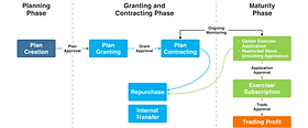
Mapping ESOP System Process
Facing the complexity of integrating multiple external systems and coordinating workflows across roles—contracting companies, securities firms, and employees—I worked closely with the Product Manager to tackle these challenges. I led cross-department discussions, clarified requirements, and iteratively drafted the ESOP system architecture. This collaborative process allowed us to finalize a solution that aligned with business needs and supported the platform’s design.
How ESOP systems interact with other platforms

ESOP system working mode

Creating the Sitemap
To translate this architecture into a user-friendly experience, I then created a detailed sitemap with the Product Manager. This sitemap organized the system’s structure, guided navigation and user flows, and established a well-structured information hierarchy—making the platform intuitive and easier to use.

Design Process
Although I created the overall framework of the sitemap, during my tenure I focused on delivering high-fidelity designs for the Organization Management and Equity Incentive Plan Management modules.

From User Flows to High-Fidelity Design
I designed user flows for each module sequentially, using the sitemap as a guide and collaborating closely with the Product Manager. Flows involving other platforms or departments required coordination through the Product Manager to ensure feasibility. I also worked with the development team to clarify technical constraints and confirm actionable solutions.
The modules I designed during the project included:
-
Login
-
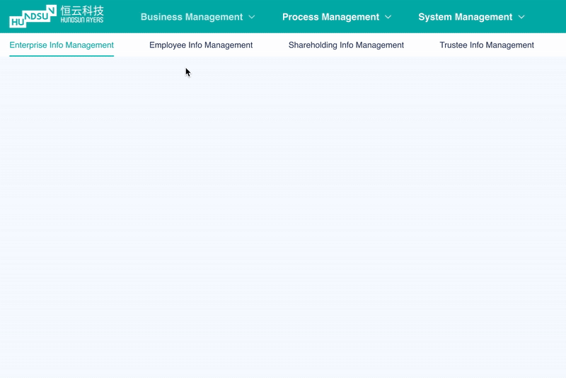
Enterprise Management
-
Employee Information Management
-
Shareholding Information Management
-
Trustee Information Management
-
Incentive Plan Management

Once the flows were finalized, I translated them into high-fidelity screens. To maintain consistency with other Hundsun products, I leveraged the existing component library. While the subsidiary requested a new theme color to differentiate the platform from the parent company’s products, I only adjusted the colors to emphasize security and trust, keeping all other components consistent.


Below, I’ll walk through several key considerations and challenges I addressed in the high-fidelity design.
High-Fidelity Design Challenges
Challenge 1 – Login Page Illustration
Problem
As the sole designer, I was responsible not only for UX but also for the visual design. The login page needed to convey a light, efficient, and user-friendly experience.
Solution
I designed the login page illustration myself using Adobe Illustrator, focusing on a visually engaging and intuitive experience aligned with leadership’s theme direction.
Result
The interface became clean, cohesive, and inviting, enhancing user engagement while maintaining simplicity and accessibility.

Challenge 2 – Navigation Design
Problem
The sitemap revealed a three-level navigation structure. While the first and third levels had few items, the second level was extensive. Typical B2B side navigation would overwhelm users, especially since the second level was rarely switched, and stakeholders wanted users focused on core tasks.
Solution
I replaced the side navigation with a top horizontal bar, grouping second-level items in dropdown menus. This minimized clutter while reserving maximum space for task execution.
Result
Users experienced a clean, task-focused interface with ample workspace, supporting both workflows and stakeholder requirements.


Challenge 3 – Shareholding Information Management
Based on the previously defined user flow, the platform needed to guide users through creating a new shareholding platform. The challenge was to translate a multi-step, complex process into clear, actionable screens.

Stage 1 – Onboarding Existing Shareholding Data
Problem
Many companies already had existing shareholding plans, and re-entering all information manually would be time-consuming and error-prone.
What I did
I proposed a file upload feature to auto-fill information. After discussing with developers, we realized the system couldn’t reliably parse all file types. To solve this, we created a standardized template that users could download, adjust their data to fit, and then upload for accurate processing.
Result
This approach respected user needs, stayed technically feasible, and enabled faster onboarding, reducing errors and building trust through a predictable, efficient process.

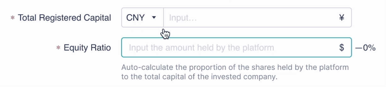
Stage 2 – Entering Core Shareholding Information
Problem
After onboarding, users needed to input complex data across multiple sections, which could feel overwhelming and error-prone.
My Innovation
I focused on three key modules—Basic Platform Information, Incentive Equity Information, and Trustee Holding Information—and visually separated them for easier navigation. To further improve usability, I added an innovation: when users enter a numeric amount, the system automatically calculates and displays the corresponding percentage. This helps users quickly understand proportions, reducing cognitive load and improving efficiency.
Result
Users could complete data entry with greater clarity and confidence, while the visual separation and real-time feedback enhanced the overall experience.

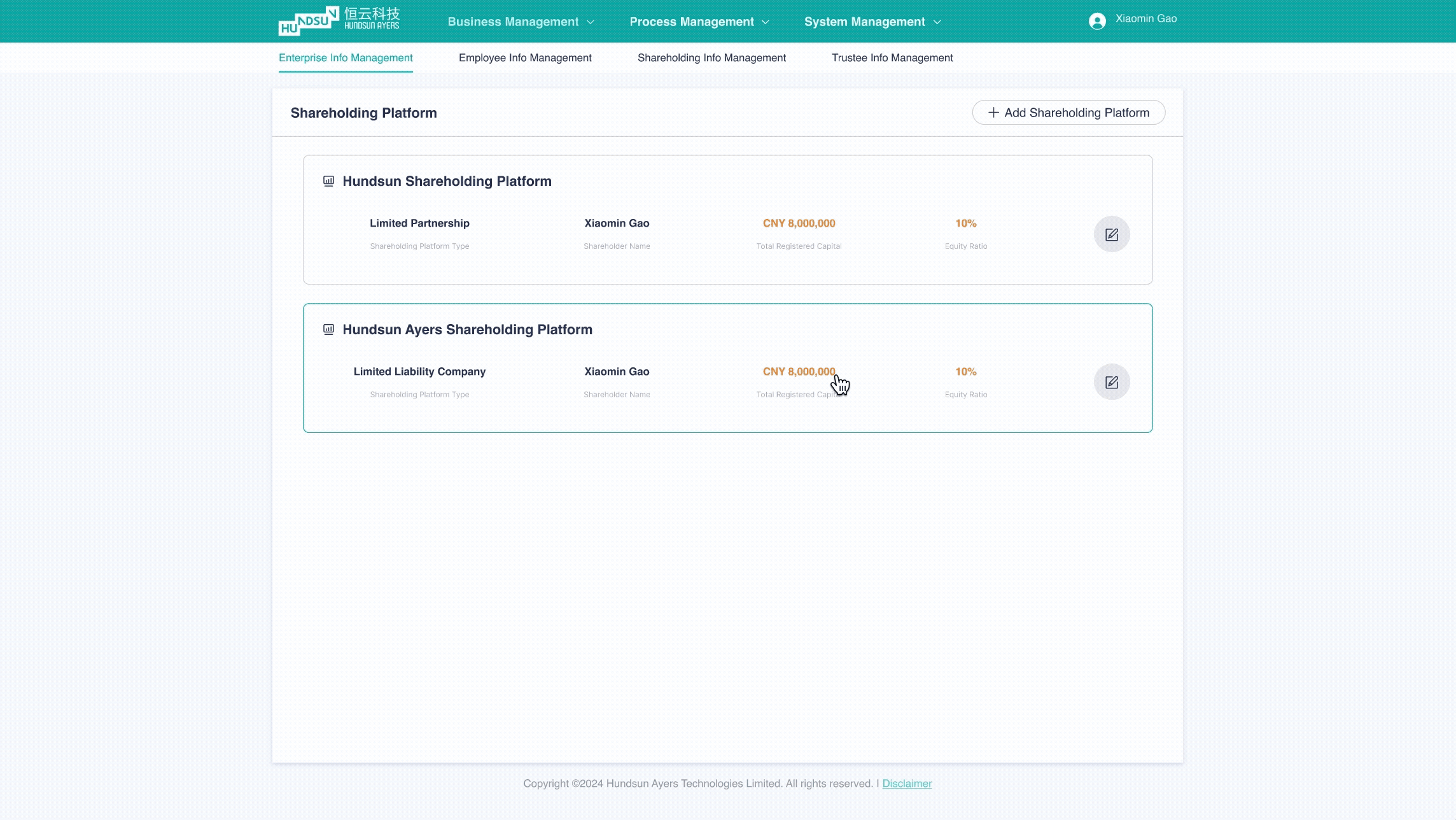
Stage 3 – Managing Created Shareholding Platforms
Problem
Once a platform was created, users needed to view and edit details without losing context or facing unnecessary page reloads.
What I did
I implemented modal pop-ups for viewing and editing platform details instead of full-page navigation. Usability testing showed these actions were infrequent, so modals allowed users to stay on the list view. This design also reduced development complexity and system load.
Result
Browsing and editing became faster and smoother, minimizing context switching and making the interface more efficient for users.
Challenge 4 – Creating a New Incentive Equity Plan
Once company, employee, and shareholding platform information was ready, users could start creating an Incentive Equity Plan.
The problem
The process was highly complex and overlapping. When I first reviewed the reference materials, everything felt chaotic, unstructured, and lacking hierarchy. Users could easily get lost, and mistakes early in the workflow could cascade into later steps.
How I solved it
I mapped all the scattered pieces on paper, gradually identifying patterns and relationships between different levels. For unclear parts, I iterated multiple times with the Product Manager to establish a logical flow. This resulted in a structured, end-to-end user flow capable of supporting complex grant scenarios.

To make this story concise, I’ve divided the process into five representative stages, highlighting design decisions and outcomes.
Stage 1 – Defining the Grant Plan
The problem
The Grant Plan is the core of the Incentive Equity Plan—it determines how equity is allocated. Everything depended on first confirming the total grant amount. Initial references only included two types (One-time and installment), which limited flexibility for companies with unique strategies.

What I did
I clarified the flow with the Product Manager. Users must first set the total grant amount, then choose from three options: One-time, installment, and customizable. The interface dynamically displayed only fields relevant to the selected type, avoiding clutter.
The outcome
The design became clearer, more flexible, and user-friendly. Companies could follow a simple, logical process while retaining control over complex allocation strategies.

Stage 2 – Designing Grant Type Inputs
1. One-Time Grant
The problem
Users needed to enter Reserved Shares as an amount or percentage. My initial numeric-only design didn’t match user habits. Large numbers made mental conversion difficult, and some users preferred calculating by percentage instead of amount.
What I did
I redesigned the input to allow either value. The system auto-calculates and displays the other, and both fields remain editable.
The outcome
Users could input large grants efficiently and flexibly, reducing cognitive load and improving accuracy.

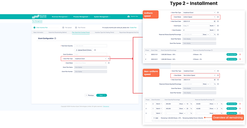
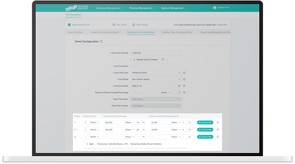
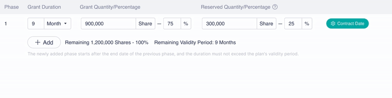
2. Installment Grant
The problem
Step-by-step inputs made understanding overall distribution difficult, especially in non-uniform speed mode. Users struggled to balance shares, percentages, and timelines, leading to confusion and misallocation.
What I did
I added a visual overview of the entire plan at the bottom of the form. Users can adjust share amounts and timelines directly, enter either percentages or amounts with automatic conversion, and track remaining shares and periods in real time.
The outcome
Planning became intuitive and manageable, even for complex non-uniform allocations, reducing errors and increasing confidence.
Stage 3 – Maintaining Context in Multi-Step Workflows
The problem
Even with step-by-step guidance, users often forgot earlier inputs. Since each step depends on the previous one, this caused mistakes. Step-by-step data handling was also required to reduce system load.
What I did
I introduced an overview summary at the start of each new step, showing completed information from previous steps.
The outcome
Users gained a clear reference, reducing memory burden and mistakes. It also supported technical requirements for step-based saving and loading, improving performance and reliability.

Stage 4 – Overview After Completing the New Incentive Equity Plan
The problem
The Incentive Equity Plan process is long and multi-step. Even after finishing all grant details, users needed a clear way to review what they had entered before moving forward. Without this, mistakes could go unnoticed, and users might feel uncertain about their entries.
What I did
I designed a final overview screen showing all completed plan details in a clear, structured layout. This included grant types, allocations, timelines, and percentages, allowing users to review and confirm before submission.
The outcome
Users gained confidence that all information was correct. The overview reduces errors and provides a single reference point for review, improving overall usability and satisfaction.

Stage 5 – Managing All Incentive Equity Plans
The problem
Once multiple plans exist, users needed a way to manage and track them efficiently. Without a consolidated view, it would be difficult to monitor status, compare plans, or make edits.
What I did
I designed an Incentive Equity Plan list view. Each plan shows key details such as total grant amount, types, status, and next steps. Users can view, edit, or duplicate plans directly from the list without leaving the page.
The outcome
The consolidated list improved efficiency and oversight. Users can quickly scan, access, and manage all existing plans, reducing navigation complexity and improving operational clarity.

Testing & Refinement
Finally, I collaborated with the testing team to gather user feedback and analyze features needing improvement based on provided data. While the testing team focused on function availability and user retention, I participated to ensure UI feasibility and address user experience issues, guaranteeing a seamless user process.
Improvement
Equity incentive plan module step optimization
The equity incentive plan module involved complex processes with intersecting internal steps. Based on user feedback and several design revisions, I replaced the original long step bar with a double-layer distributed step bar. This improvement helped users better understand the smaller sub-processes within each major step, reducing user anxiety and enhancing clarity.


Grant configuration calculator optimization
Based on user feedback, I improved the grant plan calculator by automating the distribution of shares during the increasing stage. This change eliminated the need for users to manually calculate values, saving time and simplifying the process while still allowing for customization.

Outcomes & Impact
The ESOP system not only simplified complex workflows but also delivered measurable impact for both users and the business:
